Customizing an embedded Matplotlib Graph in Tkinter
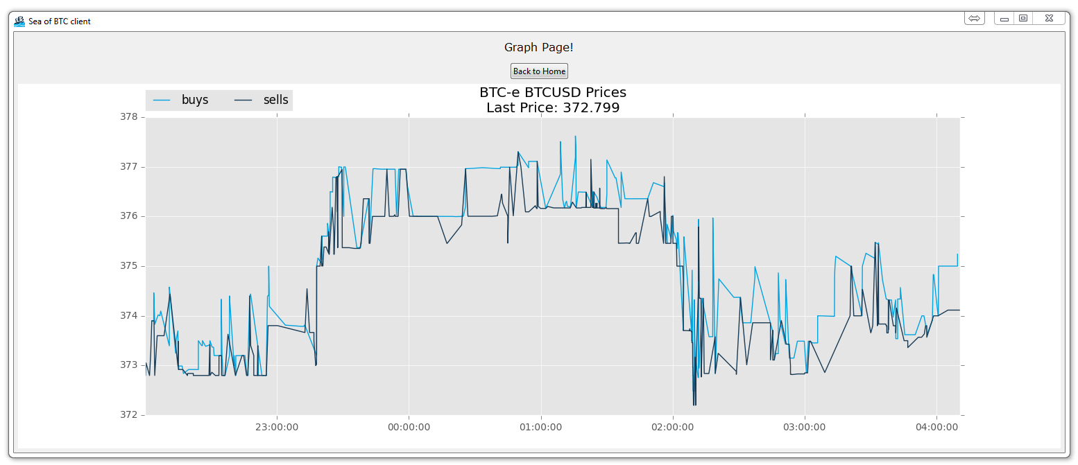
We've got the data, and the graph, but now we might want to change the graph a bit. Here, we'll be changing some of the basic visual aspects of our graph, feel free to add your own touch. Here's our new animate function:
def animate(i):
    dataLink = 'https://btc-e.com/api/3/trades/btc_usd?limit=2000'
    data = urllib.request.urlopen(dataLink)
    data = data.readall().decode("utf-8")
    data = json.loads(data)


    data = data["btc_usd"]
    data = pd.DataFrame(data)

    buys = data[(data['type']=="bid")]
    buys["datestamp"] = np.array(buys["timestamp"]).astype("datetime64[s]")
    buyDates = (buys["datestamp"]).tolist()


    sells = data[(data['type']=="ask")]
    sells["datestamp"] = np.array(sells["timestamp"]).astype("datetime64[s]")
    sellDates = (sells["datestamp"]).tolist()

    a.clear()

    a.plot_date(buyDates, buys["price"], "#00A3E0", label="buys")
    a.plot_date(sellDates, sells["price"], "#183A54", label="sells")

    a.legend(bbox_to_anchor=(0, 1.02, 1, .102), loc=3,
             ncol=2, borderaxespad=0)

    title = "BTC-e BTCUSD Prices\nLast Price: "+str(data["price"][1999])
    a.set_title(title)
The major changes here are that we are specifically specifying a color and a label for our plots. After that, we're creating a legend at the top left. Finally, we're making a custom title that includes the last price.

-
Programming GUIs and windows with Tkinter and Python Introduction
-
Object Oriented Programming Crash Course with Tkinter
-
Passing functions with Parameters in Tkinter using Lambda
-
How to change and show a new window in Tkinter
-
Styling your GUI a bit using TTK
-
How to embed a Matplotlib graph to your Tkinter GUI
-
How to make the Matplotlib graph live in your application
-
Organizing our GUI
-
Plotting Live Updating Data in Matplotlib and our Tkinter GUI
-
Customizing an embedded Matplotlib Graph in Tkinter
-
Creating our Main Menu in Tkinter
-
Building a pop-up message window
-
Exchange Choice Option
-
Time-frame and sample size option
-
Adding indicator Menus (3 videos)
-
Trading option, start/stop, and help menu options
-
Tutorial on adding a tutorial
-
Allowing the exchange choice option to affect actual shown exchange
-
Adding exchange choice cont'd
-
Adding exchange choices part 3
-
Indicator Support
-
Pulling data from the Sea of BTC API
-
Setting up sub plots within our Tkinter GUI
-
Graphing an OHLC candlestick graph embedded in our Tkinter GUI
-
Acquiring RSI data from Sea of BTC API
-
Acquiring MACD data from Sea of BTC API
-
Converting Tkinter application to .exe and installer with cx_Freeze
